

Back
customer account redesign
Role
End-to-end design
Team
2 UX/UI Designers, 4 Product Owners, 3 Development teams
Good Energy wished to bring their online account and app development in-house, to improve agility in answering customer and business needs. This provided opportunity to learn from the existing implementations and rebuild the products from the ground up with the user at the centre of all decision-making.
- Digitally engaged users are +176% YOY, resulting in a drop of 8% in customer support calls
- Both the online account and the mobile app are accredited as accessible by The Shaw Trust
- The iOS app is rated 4.7/5 stars, and the Android app 4.5/5 stars by over 5,000 customers
finished outcomes
problem statement
Customer reliance on support teams to accomplish key account tasks such as submitting meter readings, making payments, and changing account details stretched resource beyond capacity. Existing online products provided a poor user experience, which reinforced a resistance to engage amongst the core demographic.
research
Initial analysis
GA4 data, PowerBI reports and Hotjar feedback provided performance insight for the existing, externally-developed customer accounts. Pinpointing areas of focus, I took note of KPIs such as digital engagement and support call reason codes to provide a baseline to measure impact of future implementation on customer and business goals.
Understanding the customer
I produced a set of 9 user scenario cards by combining a wide range of market and customer data and research. This provided stakeholders with a spectrum of real-life situations to aid decision making and stress-test proposed outcomes. The cards provide a snapshot of customer accounts, as well as other key consideration such as accessibility needs, device type, and digital competency.
User scenario card for Dot, an 82-year-old customer with limited digital competency and accessibility considerations.
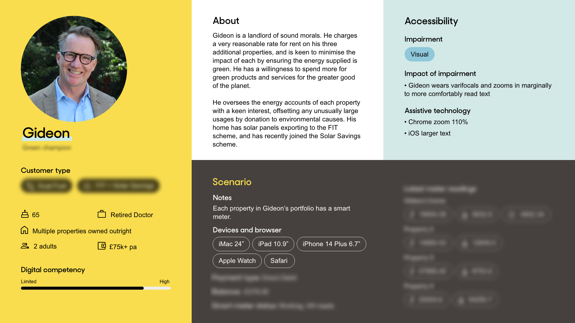
User scenario card for Gideon, a 65-year-old customer with high digital competency and multiple properties.
design
Wireframing
Mapping the process for both front-end and the back-end architecture took place at this stage to guide technical spikes undertaken by the Development and Data teams. Any new UX patterns were informed by best practice with a particular focus on the GOV.UK design system and WCAG 2.2 accessibility standards.
Design system
Utilising Figma variables and components, we implemented a new design system in line with existing brand guidelines to ensure consistency, with additional implementation documentation created to assist development.
Colour variables in Figma, utilising tailwind naming conventions for ease of handover.
Example of text, checkbox and toggle option input components in Figma, with different variants for default, active/hover, focus and error.
Additional documentation provided for each component, with states for light and dark mode and a detailed breakdown of component anatomy.
testing
Prototyping
In order to switch off the existing services, the new products had to allow for key customer journeys such as making a payment and submitting a meter reading, with the aim to stand up quickly and improve, guided by feedback, in agile. Early prototypes were built to test with customers via Maze to test or aid design decisions across key features.
Heat map results from Maze prototyping task.
Customer feedback
Prior to launch, I facilitated user interviews with internal and external customers. From their feedback, I used affinity mapping techniques to highlight areas for immediate improvement. Post-launch we provided clear avenues for feedback within each product via Hotjar surveys.
Facilitating a user interview over Microsoft Teams. The interviewee is sharing their Dashboard screen.
handover
Stakeholder approval
Dedicated presentation sessions were carried out for each new feature or improvement with Product Owners and stakeholders where relevant to discuss the finalised designs. I worked with the Digital Analysts to ensure we were able to implement tracking to understand user behaviour once implemented.
Decision trees
In order to clearly communicate complex logic, decision trees were implemented alongside designs.
Decision tree for Dashboard alert logic and prioritisation
Monday.com
I produced bespoke documentation to handover features and continuous improvements to the Product Owners. This provided an overview of intention, links to the designs and relevant spec in the design system. Using MoSCoW prioritisation methodology, each feature or CI was ranked to assist with sprint planning.
Support
Utilising my broad skillset and experience, I supported implementation through development to launch by advising developers, onward customer communications and marketing strategy. I created app store imagery, building templates to expedite future updates.
ongoing improvement
Ongoing analysis
Working closely with the Data Insights team, reports were built to monitor KPIs and key journeys to observe performance to pinpoint areas for further improvement. Additionally, there are feedback mechanisms in both products that provide customers with a way to report bugs or suggest ideas via Hotjar that I review every 3 months, affinity mapping to observe key themes.
Prioritisation
I run regular prioritisation workshops with the Product Owners to prioritise features and improvements, carefully balancing the volume of feedback with users impacted, technical feasibility and business goals. The highest scoring items are transferred to a continuous improvements backlog in Monday.com to be fed into development backlogs.
I use Miro to collate and analyse customer feedback. The tool facilitates easy collaboration and allows the visual weighting of feedback.
Back
customer account redesign
Role
End-to-end design
Team
2 UX/UI Designers, 4 Product Owners, 3 Development teams
Good Energy wished to bring their online account and app development in-house, to improve agility in answering customer and business needs. This provided opportunity to learn from the existing implementations and rebuild the products from the ground up with the user at the centre of all decision-making.
- Digitally engaged users are +176% YOY, resulting in a drop of 8% in customer support calls
- Both the online account and the mobile app are accredited as accessible by The Shaw Trust
- The iOS app is rated 4.7/5 stars, and the Android app 4.5/5 stars by over 5,000 customers
finished outcomes
problem statement
Customer reliance on support teams to accomplish key account tasks such as submitting meter readings, making payments, and changing account details stretched resource beyond capacity. Existing online products provided a poor user experience, which reinforced a resistance to engage amongst the core demographic.
research
Initial analysis
GA4 data, PowerBI reports and Hotjar feedback provided performance insight for the existing, externally-developed customer accounts. Pinpointing areas of focus, I took note of KPIs such as digital engagement and support call reason codes to provide a baseline to measure impact of future implementation on customer and business goals.
Understanding the customer
I produced a set of 9 user scenario cards by combining a wide range of market and customer data and research. This provided stakeholders with a spectrum of real-life situations to aid decision making and stress-test proposed outcomes. The cards provide a snapshot of customer accounts, as well as other key consideration such as accessibility needs, device type, and digital competency.
User scenario card for Dot, an 82-year-old customer with limited digital competency and accessibility considerations.
User scenario card for Gideon, a 65-year-old customer with high digital competency and multiple properties.
design
Wireframing
Mapping the process for both front-end and the back-end architecture took place at this stage to guide technical spikes undertaken by the Development and Data teams. Any new UX patterns were informed by best practice with a particular focus on the GOV.UK design system and WCAG 2.2 accessibility standards.
Design system
Utilising Figma variables and components, we implemented a new design system in line with existing brand guidelines to ensure consistency, with additional implementation documentation created to assist development.
Colour variables in Figma, utilising tailwind naming conventions for ease of handover.
Example of text, checkbox and toggle option input components in Figma, with different variants for default, active/hover, focus and error.
Additional documentation provided for each component, with states for light and dark mode and a detailed breakdown of component anatomy.
testing
Prototyping
In order to switch off the existing services, the new products had to allow for key customer journeys such as making a payment and submitting a meter reading, with the aim to stand up quickly and improve, guided by feedback, in agile. Early prototypes were built to test with customers via Maze to test or aid design decisions across key features.
Heat map results from Maze prototyping task.
Customer feedback
Prior to launch, I facilitated user interviews with internal and external customers. From their feedback, I used affinity mapping techniques to highlight areas for immediate improvement. Post-launch we provided clear avenues for feedback within each product via Hotjar surveys.
Facilitating a user interview over Microsoft Teams. The interviewee is sharing their Dashboard screen.
handover
Stakeholder approval
Dedicated presentation sessions were carried out for each new feature or improvement with Product Owners and stakeholders where relevant to discuss the finalised designs. I worked with the Digital Analysts to ensure we were able to implement tracking to understand user behaviour once implemented.
Decision trees
In order to clearly communicate complex logic, decision trees were implemented alongside designs.
Decision tree for Dashboard alert logic and prioritisation
Monday.com
I produced bespoke documentation to handover features and continuous improvements to the Product Owners. This provided an overview of intention, links to the designs and relevant spec in the design system. Using MoSCoW prioritisation methodology, each feature or CI was ranked to assist with sprint planning.
Support
Utilising my broad skillset and experience, I supported implementation through development to launch by advising developers, onward customer communications and marketing strategy. I created app store imagery, building templates to expedite future updates.
ongoing improvement
Ongoing analysis
Working closely with the Data Insights team, reports were built to monitor KPIs and key journeys to observe performance to pinpoint areas for further improvement. Additionally, there are feedback mechanisms in both products that provide customers with a way to report bugs or suggest ideas via Hotjar that I review every 3 months, affinity mapping to observe key themes.
Prioritisation
I run regular prioritisation workshops with the Product Owners to prioritise features and improvements, carefully balancing the volume of feedback with users impacted, technical feasibility and business goals. The highest scoring items are transferred to a continuous improvements backlog in Monday.com to be fed into development backlogs.
I use Miro to collate and analyse customer feedback. The tool facilitates easy collaboration and allows the visual weighting of feedback.